

20+ Eye-catching Website Color Schemes You Shouldn’t Miss


A carefully selected website color scheme is crucial to shaping user experience and can greatly impact visitor psychology. The right color combination doesn’t just improve visual appeal—it strengthens brand identity, builds trust, and can even drive specific user actions.
This guide will dive into the essentials of color theory and provide inspiring website color schemes, ideal for eCommerce, blogs, and corporate sites. By understanding the psychology of colors and seeing successful examples, you’ll discover how to create a visually cohesive and purpose-driven website design.
Color Theory Principles: Things to Know
Before I start listing all sorts of website color schemes, it is important to cover some basics. For instance, you should know the subtle meaning behind every color and how different shades can be combined.
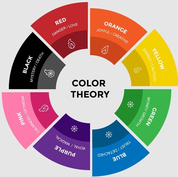
Color Meanings & Symbolism
You might already know that there are some warm shades (like yellow, orange, and red) and cool shades (like blue, violet, or green). Though, our mind can automatically interpret the meaning behind a color on its own. Here are some of the major colors that are used in designing with their subliminal meaning:
- Red: Passion, love, anger
- Yellow: Hope, happiness, sunshine
- Orange: Happiness, energy, vitality
- Pin: Calm, young, optimistic
- Tan: Conservative, pure, earthy
- Beige: Simple, elegant, royalty
- White: Pure, clean, luxury
- Black: Elegant, sophisticated, mysterious
- Blue: Nobel, calm, responsive
- Purple: Grand, wealthy, playful
- Green: Nature, helpful, abundance
- Gray: Formal, conservative, trusted
- Brown: Dependable, nature, conservative
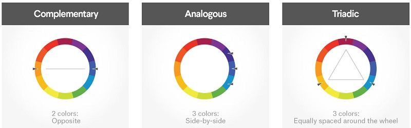
Different Styles of Color Schemes
Based on the placement of different colors, we can come up with an entire color wheel. Now, we can pick shades, hues, and tints from different places on the wheel. The way we pick shades can give birth to your overall color scheme, which can be identified as:
Complementary
This is one of the most common types of color schemes in which we pick shades from two opposite places of the wheel. For instance, the combination of red and green can be an example of complementary scheme.
Analogue
Unlike complementary, we pick multiple shades from the adjoining places in the wheel. In this way, we provide a uniform appeal instead of a contrasting one. For instance, picking red, yellow, and orange in a single design would be an example of an analogue scheme.
Triadic
In this, we pick three different colors from different ends of the spectrum. These shades are equally spaced in the color wheel and can instantly pop out due to their distinctive appeals.
20+ Stunning Website Color Schemes to Consider
Without much ado, let’s explore some of the best website color schemes out there that you can also use while setting up your online presence.
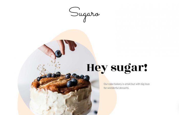
1. Turquoise & Coral: Playful and Lively
If you want to grab the attention of your audience instantly, then go with this website color scheme. It is both playful and bright that would appeal to a more youthful audience.
2. Black & Gray: Luxurious and Sophisticated
Here’s one of the best examples of website color schemes that oozes sophistication and class. While it might seem a bit too dark at first, you can include different colored accents to match it with your brand’s image.
3. Shades of Blue: Elegant and Luxury
If you like blue, then this should be your go-to color scheme. The bold scheme includes two strong and dependent colors, providing a stunningly uniform look on the website.

4. Pastel Pink & Blue: Inviting and Sweet
Pink can be one of the best choices for having a youthful and contemporary look on your website. When combined with another shade of sky blue, it can do wonders and make your page look extremely appealing.
5. Blue, Black, & White: Eye-catching and Subtle
This is certainly one of the most subtle and bold website color schemes out there. While black and white would sit at the extreme ends of the spectrum, blue will come out as a neutral shade – balancing the entire canvas.

6. Grey & Beige: Chic and Classy
For all those who want to impart a more earthy and natural look, this would be an ideal combination. It is best suited for online stores selling furniture, décor, or organic goods due to its earthy tone.
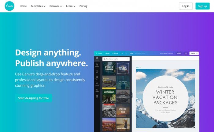
7. Blue & Green Gradient: Modern and Simple
Canva has come up with this stunning look by mixing the gradients of blue and green. Not only it is quite fun to look at, but it also justifies the overall image of the brand seamlessly.
8. Yellow & Teal: Bold and Bright
In case you are fine with taking risks, then I would recommend playing with yellow. You can always mix it with a complementary tone like teal to make the design striking and bold.

9. Gold & Black: Modern and Sophisticated
Here, you can see the background canvas of black with shades of golden, giving it a fresh and unique appeal. Ideally, these two colors can do wonders, but their execution would play a vital role too.

10. Blue & Purple: Dependable and Sleek
While blue and purple might not seem a great combination on paper, the way you execute them can make all the difference. You can also include accents of white for icons and texts to make it cleaner.

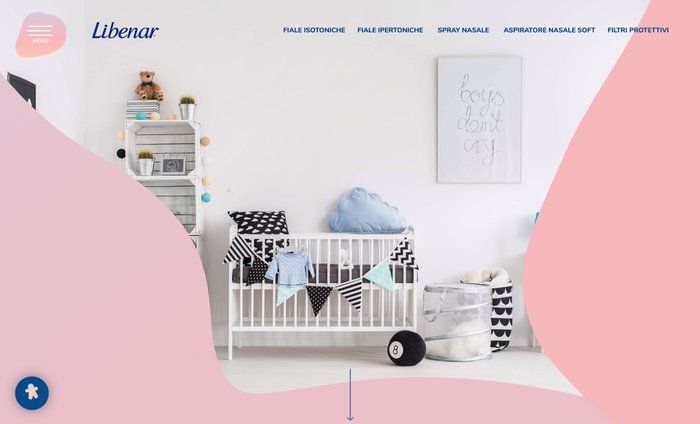
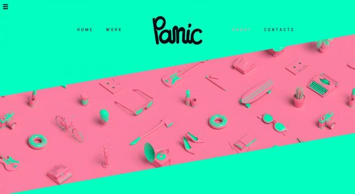
11. Neon Green & Pink: Fun and Bright
With colors like neon green and pink, you can instantly grab the attention of your audience. The color scheme would work best if your customers are young or you have fresh products to offer.
12. Purple & Pink: Refreshing and Classic
Purple and pink can both create distinctive statements, and their combination will not let you down. Here’s a perfect example of how you can implement this color scheme.

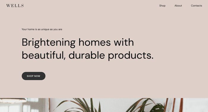
13. White & Beige: Soft and Understated
You might already know that white can go with almost every other shade. The combination of beige and white is no such exception as it provides such a soft and classy appeal.
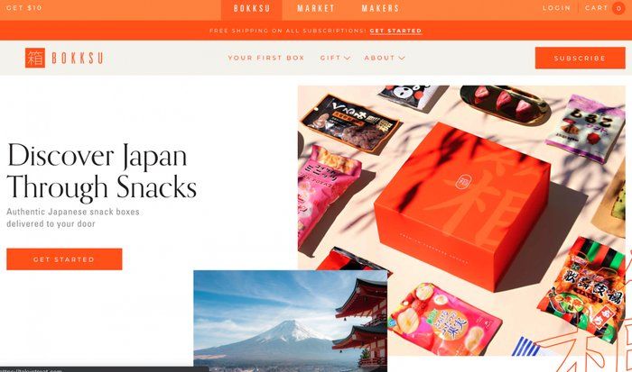
14. Orange & White: Bright and Invigorating
This is another classic example of how white can go with other shades flawlessly. This is one of the best website color schemes for those who want to impart a fun appeal to their website.
15. Yellow & White: Classic and Clean
Yellow and white is an evergreen combination that never seems to disappoint. Here’s how you can make this combination work by following a proven approach.

16. Navy, Light Blue, & Pink: Striking and Modern
These three colors are quite unique and have their distinctive touch. Though, if you implement the scheme smartly, then it can easily help you win over your audience.

17. White, Gold, & Olive: Classic and Luxury
The combination of these three statement shades can form one of the most appealing website color schemes. This will make your website look classy and luxurious at the same time.

18. Green, Red, & Beige: Trustworthy and Playful
Here’s another smart example of how these three colors can be included with a playful time. The design features a beige background with different green and red accents.

19. Light Pink & White: Understated and Soft
This can be another option to create website designs for feminine products. The scheme looks quite stunning and can make your website look relatable as well.

20. White & Gray: Spacious and Dependable
As you can see from this example that how white and gray are combined so perfectly. The color scheme has made the overall design pretty neat and spacious.

21. Purple & Beige: Professional and Playful
Lastly, you can consider implementing a combination of purple and beige. For instance, Slack has also utilized the same combination that has imparted a unique and fun appeal to the website.

Start Your Dropshipping Journey with DSers
I’m sure that these website color schemes must have helped you pick the right design for your online store. After that, you can simply take the assistance of DSers to set up an online dropshipping store in a jiffy.
| Get Started Now to Grow Your Online Business with the Best AliExpress Dropshipping Tool - DSers! |

- DSers is the official AliExpress dropshipping solution that can seamlessly be integrated with platforms like Wix, Shopify, and WooCommerce.
- You can instantly find any product of your choice by uploading its image, entering keywords, or pasting its AliExpress URL.
- To manage your orders and keep your customers informed, you can use its automated tracking of order statuses. You can also use its PayPal integration for the automatic syncing of tracking numbers.
- Using DSers is free, and it can help you manage multiple stores in one place. To access its advanced features, you can upgrade your account.
- Some other features of DSers are variant mapping, bundle products, bulk purchasing, stock management, and so on.

Final Words
As you can see, there can be different kinds of website color schemes that you can seek inspiration from. Though, I would recommend getting familiar with the principles of color theory to implement these schemes in a better way.
Feel free to explore the above-listed schemes and make sure they match the overall voice of your brand before implementing them. Also, you can explore a powerful tool like DSers that can help you manage your dropshipping store on your preferred platform at ease.


 Company
 Why Choose DSers
 Blog
Blog
 Help Center


 Live Chat
